The Devil Is In The Details
They say the devil is in the details, and when it comes to gardens, “they” are not wrong.
Thursday was a rainy day and I really wanted to work in my garden, but spoiled by the recent warm weather or perhaps still chilled by this winter’s excessive, prolonged cold spells, I decided to wait until it warmed up a notch. Instead of gardening I pulled out my photos of the Georgetown Garden Tour, which was a few weeks ago. It was another tour-de-force (pun intended) carried out by the Georgetown Garden Club, so it should come as no surprise that I took loads of photos. What did come as a surprise is that of the hundreds of photos I took, it is the details of the gardens that really stand out. Some years it’s the plants that grab me, some years it’s design or color, but this year it was detail.
As in so much of life, the details in the garden, or lack of details, make a palpable difference. Take “hardscape” for example, hardly a popular cocktail party topic but terribly important, nonetheless. Hardscape is the components of the garden that is made of stone, cement, or brick, etc, i.e., the hard materials that hold everything together. Badly executed hardscape can make a good design look like a bad Rolex knock-off on a high-end model in a designer suit.
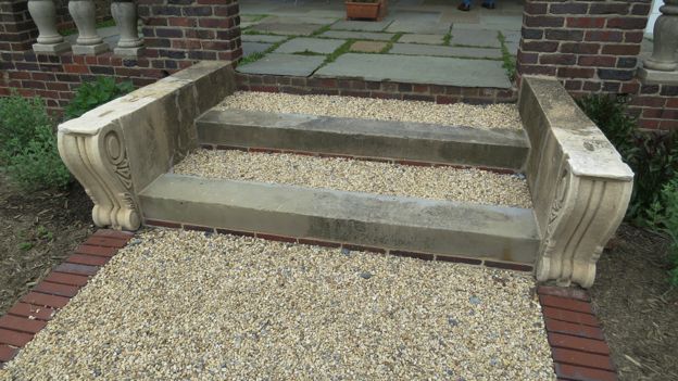
Well done, or better yet, creatively and well done, hardscape can make a design fantastic. There was a lot of good and creative hardscape on the tour this year, and I especially liked the steps made of brick, granite, gravel, and a pair of what might once have been corbels from the cornice of a building. It is hard to combine so many elements in such a compact unit, but this effort was quite good. The bricks tied the composition to the surrounding and previously existing brick walls; the corbels on the sides of the steps were an imaginative touch and worked perfectly with the balusters nearby; and the dark granite treads added a weighty gravitas. I am a great fan of gravel walks, because of the crunching sound your feet make as you stroll along, and, in this case, its texture and color served successfully to connect the colors of the balusters, treads, and flagstone.
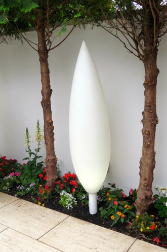
In addition to hardscape, lighting is a big deal. Bad lighting can ruin a garden. The lights in the one very modern garden on the tour, however, were especially chic. By day they were a sculptural feature that didn’t dominate the small space despite their size, probably because they were white against a white wall. By evening, this pair of lights undoubtedly glows softly, providing just enough light to make the garden rather romantic – quite a coup in a modern garden with very clean lines. Perhaps next year’s tour will be in the evening so we can enjoy this scene. Cocktails, anyone?
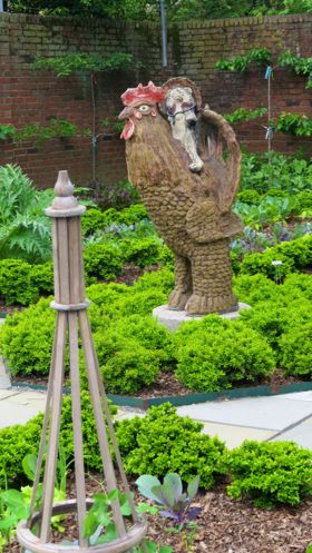
Sculpture, in general is a great addition to most landscapes or gardens but can detract if overdone orbadly done. On this tour, there were several beautiful pieces. Some were very serious and others were traditional. One of my favorites was the rooster in the impressive and skillfully designed potager adjunct to the tour’s largest and most complex gardens. Part of what I liked about this touch was that the rest of the garden was an impressive series of “rooms”, handsome and impeccably maintained, and above all, immensely tasteful. All the more delightful, then, to turn the corner and find this bit of whimsy presiding over what promises to be a productive vegetable garden.
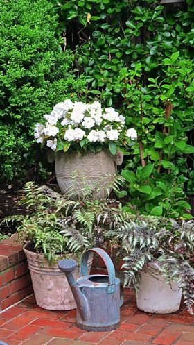
Details in the form of vignettes are also effective. They quickly reveal the vision and style of those who occupy the garden, and are especially powerful when the style of the gardener and the style of the garden merge. The gray pots on the brick terrace in one of the tour’s larger, more traditional gardens, coupled with a vintage watering can, was especially sophisticated. There were several (but not too many) perfect vignettes in this garden and it was difficult for me to choose which I liked best. I chose this one because its choice of colors, plant materials (white New Guinea impatiens and the perennial gray Japanese Painted Ferns (Athyrium niponicum)set against a background of dark green box), and the counterpoint of the watering can, which, informal and functional, in contrast to this otherwise formal scene, was brilliantly balanced and elegant. It “works” because the whole garden is elegant and simultaneously livable.
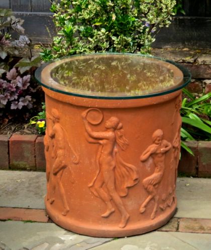
Classy casual functionality was also in evidence elsewhere. I especially appreciated a small side table made of a glass circle atop a detailed terracotta pot. It was so simple and clever, and best of all it went perfectly with its surroundings. An ideal touch. I can well imagine sitting there on an afternoon with a drink and a snack, with a book in hand, taking frequent peeks at the charming surroundings.

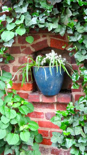
And pots, of course, are always important in and of themselves. Every year I promise myself that I will not let pots proliferate in my garden; Will not let my garden resemble a country garden shop with all merchandise for sale. I never succeed, this year, perhaps, least of all. There are pots of basil, heliotrope, catnip, begonias, clivia…you get the point. They are not all well placed nor all beautiful, so it was with admiration tinged with a drop envy that I spotted this gray-blue pot in a niche in the eastern wall of another garden. What I like about this pot is the texture of its plantings that contrast beautifully with the ivy on the wall. I found myself wondering if I could use such a pot somewhere, but quickly reprimanded myself for the thought.
And so it was a wonderful garden tour again, and God, not the devil, was absolutely in the details. I can’t wait until next year’s tour.


