Digest Design III: Martha Vicas Kitchen Makeover
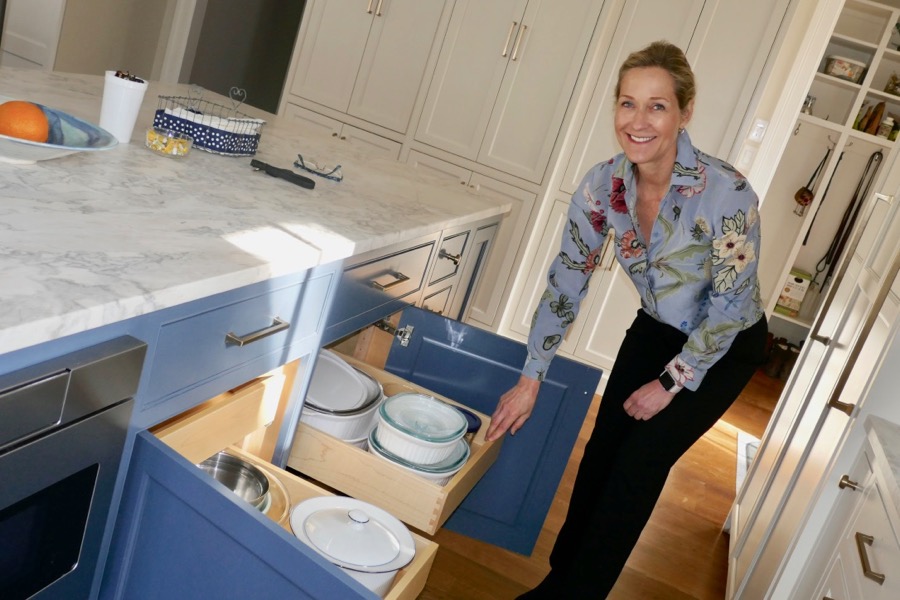
“Remodeling a kitchen makes such a difference,” explained Martha Vicas during a walk through of her latest makeover in a stately brick 1900s built colonial NW residence.
“It’s the heart of the home,” she continued, pointing to the custom gris stone and oak bar in what was recently an enclosed patio, now part of the extended dining area.
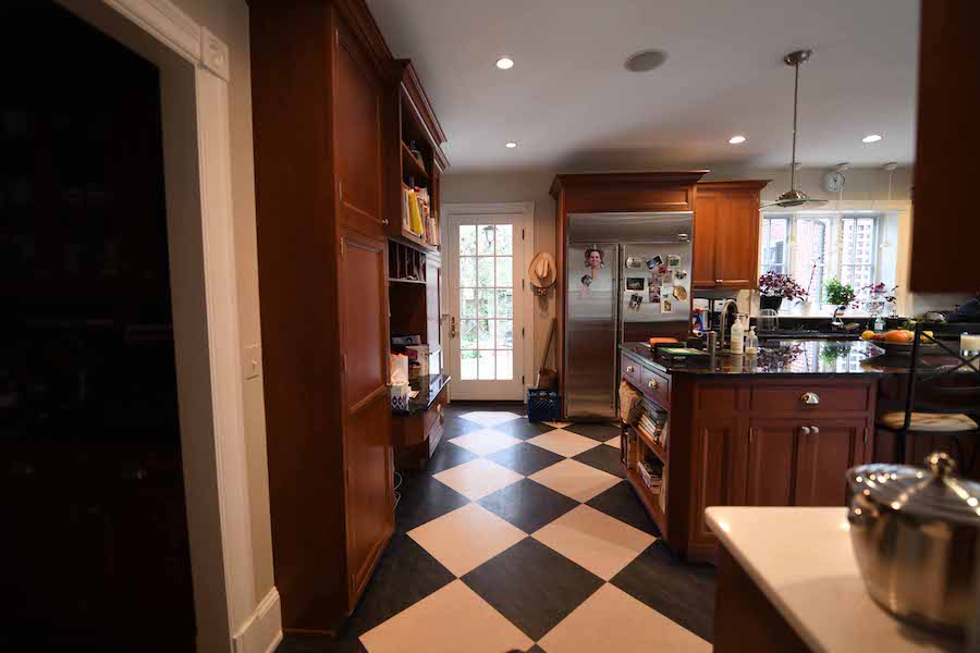
Long-time clients, Vicas recently remodeled their weekend home in Annapolis with a bright white gleaming kitchen. The family were soon finding the dark wood, granite and oversized black-and-white tiles in their DC home kitchen lacking by comparison. Time to call in M. S. Vicas Interiors again.
Before she starts, this designer always take a complete inventory. Drawer by drawer, she walks through the kitchen with her clients to see what’s there, what they have, what they use. From utensils and spices to tableware, even emptying the dishwasher to assess pivoting room and ease of access to storage cabinets. Are cookbooks at the right height, food visible in the refrigerator, plates and glassware reachable from shelves?
After taking stock, Vicas inquires about all the must haves. “One of the best ways to see what the clients really like is collect Pinterest photos. Lots of them.”
"The three main elements of a kitchen design are appliances, finishes and counter tops."
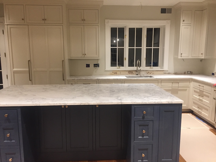
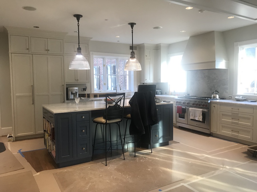
This family loved the blue satin finish cabinetry and the special shade of off-white custom lacquered cabinetry. To coordinate with the rest of the home, wood trim around the windows was done in a brighter white.
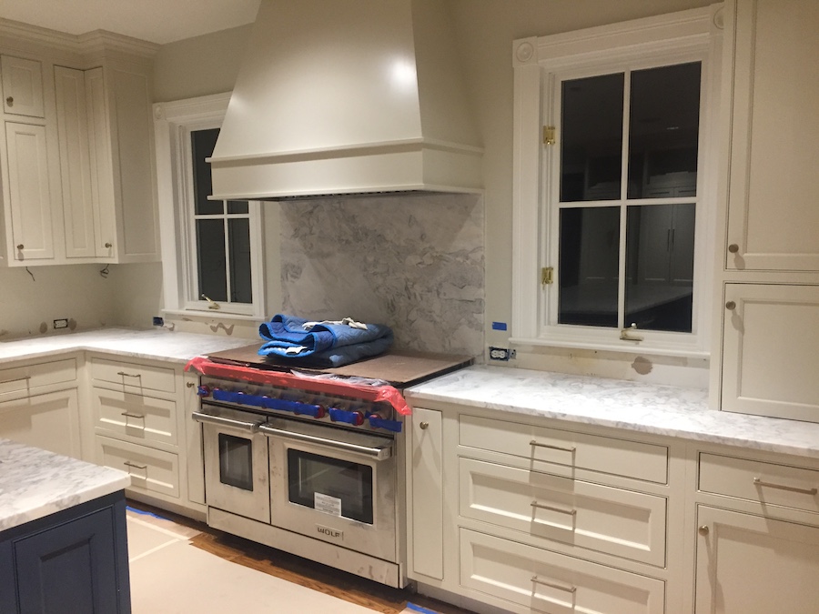
Lots of natural light streaming in, but so many windows presented a challenge when it came to selecting the right material for backsplashes. With a limited amount of space between sill and counter, tile was nixed in favor of the same marble used on the island and counter tops.
Originally wanting quartz, Vicas persuaded her clients to go with a subtle blue grey veined marble, her preferred counter top material, for its natural beauty, "After all, marble has been used in Greek and Roman temples for centuries… But it does need to be honed, as it comes out of the quarry shiny. You must seal the stone after installation and reseal it yearly.”
To pick the perfect slab, she brings all her paint and tile samples with her to make the selection in good light before the fabricator delivers the stone she’s chosen to the site.
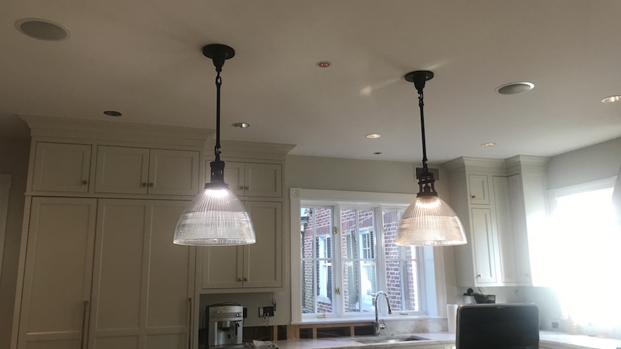
When it comes to lighting, some clients like pendants, others recessed. Adding a bit of “jewelry’ to the decor, pendants are the decorative choice. In this home, Vicas advised her clients to use pendants in the kitchen rather than the dining room. Not in both places.
Mixed metals is one of her favorite details. “Brass is very popular and looks great with the blue cabinetry, but not for faucets because they get too much usage and will patina.” She chose a bronze finish for the pendant lights.
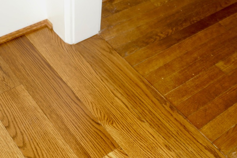
To harmonize with the rest of the home, which has 2 3/4” oak flooring, she selected a 5” oak for the kitchen area applied in the other direction.
The most rewarding part of a project for Vicas is to see her clients’ reaction to the finished product. This kitchen remodel was no exception.
*/
“We love it! The aesthetics, and now there really is a place for everything!”
