Fifty Shades of Blue
I have the blues. A raccoon has been roto-tilling my garden in search of late night snacks – worms, presumably. Several times a week I find my garden in a state of upheaval with plants that have been pulled up and dirt that has been dislocated by this unwanted intruder.
On the advice of friends and neighbors I sprinkled coyote urine granules (yes, you read that correctly) around the garden, thinking that might foil him but it seemed instead to have served as an amuse bouche. Generously distributed mothballs have not deterred him either. So, blue, I sat down amidst the mess and closed my eyes, my thoughts drifting to my trip to the 2014 Chelsea Garden Show.
Thinking about Chelsea was soothing for many reasons, not the least of which was that the immaculate display gardens were weed and, more significantly, raccoon free. Not a petal out of place. No dirt strewn thoughtlessly on paving or plants lying at precarious angles. And, coincidently, this year there was a lot of blue. Yes, blue - a multitude of shades from sapphire Siberian iris to indigo lupines (peaking along the coast of Maine just now) to cobalt columbines and more.
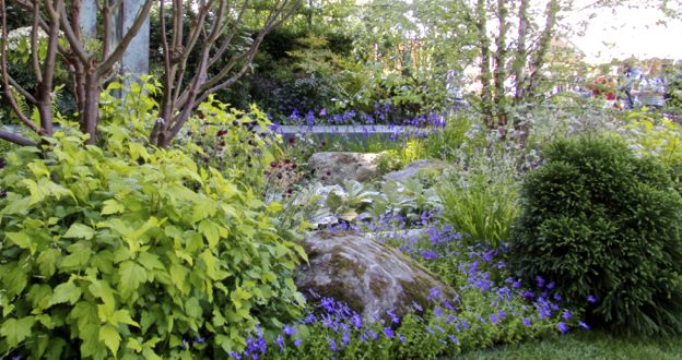
The color blue is indispensible in a garden. Blue enhances other colors, there are few colors with which it clashes, and blue-on-blue looks terrific. For example, the combination of blue violas (Viola cornuta) and blue Siberian iris (Iris siberica “Shirley Pope”) in the center of the Brewin Dolphin Garden designed by Matthew Childs, was stunning. Part of what worked so well was the difference in the heights and shapes of the flowers he chose, and part was just the serenity of the composition. Blue-on-blue is very calming. The walkways and other bits of hardscape in the garden were also tinged with grayish blue, serving to pull plant material together harmoniously with stone, pergola, and decking. Despite the informality of the mossy boulder, the simplicity of the monochromatic color scheme lent the garden an almost tailored feel.
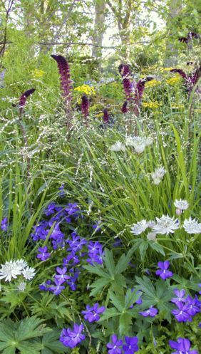
The other end of Childs’ garden, on the other hand, was definitely informal, a controlled meadowplanting. Here he combined blue Cranesbill (Geranium phaeum, not to be confused with “pelargoniums” which are commonly called “geraniums”) with pinkish burgundy loosestrife (Lysmachia atropurpurea)and white masterwort (Astrantia major ), both of which have a faint bluish cast. I loved this planting not just for the colors, but for its contrasting textures that really evoked a meadow. My only reservation was that the yellowish-green flowers in the background clashed jarringly with the pinkish burgundy.
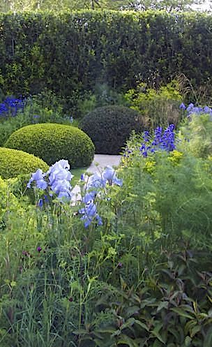
The same color, more of a chartreuse, was far more effective when combined with sky-blue bearded iris (Iris 'Blue Rhythm’ and Iris 'Jane Phillips’)and dark blue bugloss (Anchusa azurea'Loddon Royalist’)in the Telegraph Garden, designed by Tommaso del Buono and Paul Gazerwitz. The chartreuse here was mainly woodspurge (Euphorbiaamygdaloides var. robbiae) complemented by fennel. A note on fennel: While my thyme died and my rosemary took a serious hit this past winter, for some inexplicable reason my fennel returned with gusto and looks absolutely smashing among my roses, salvias, and Japanese anemones. I only wish I had planted more of it and next year I will. Both the bugloss and woodspurge are native to northern Europe, including northern Italy, and Italians practically invented how to cook with fennel, so this garden, which was supposed to evoke the Italian Lake District, also suggests that a culinary and botanical sojourn among the Italian lakes may well be in order.
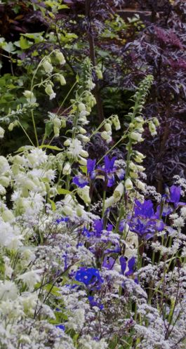
I used to find red-leafed plants difficult to work with until I saw a planting of reddish-purple smokebush (Cotinus coggygria)and blue mist shrub (Caryopteris x clandonensis) planted side by side in a Connecticut garden. Now it is one of my favorite combinations, so no surprise that I loved the Viking Cruises Garden, designed by Sadie May Stowell, complete with the prow of a Viking ship, runes, and real-life sweltering Vikings in chainmail and those nutty hats. Incongruously, one of the Vikings, with a green plastic watering can, set about watering the white and blue plantings that were meant to bring the sea to mind. The color combination I liked in this garden was made up of red maples and smoke bush behind those blue and white flowers that included white foxgloves (Digitalis purpurea alba), white fringed flower campion (Silene fimbriata ‘Alba’ ), and white columbine (Aquilegia‘Green Apples’). Tying the purples, blues, and whites together, was a perennial that I am dying to get my hands on – a purple Queen Anne’s Lace.(Anthriscus sylvestris ‘Ravenswing’). The red maples and smokebushes were actually part of an adjacent garden, but the effect was gorgeous.

Because the red leafed shrubs were in the other garden, this was also a great example of a “borrowed view” or the incorporation of features outside of the garden in a way that enhances what is inside.
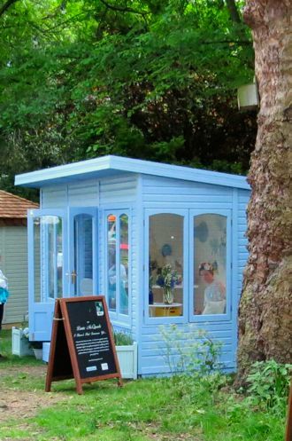
The blue theme didn’t stop at plant material. A blue teahouse around the corner caught my eye. A small structure like this in a small garden could be a great asset, especially if it had lighting and an outlet for charging computers and running fans. It could even include a sound system.
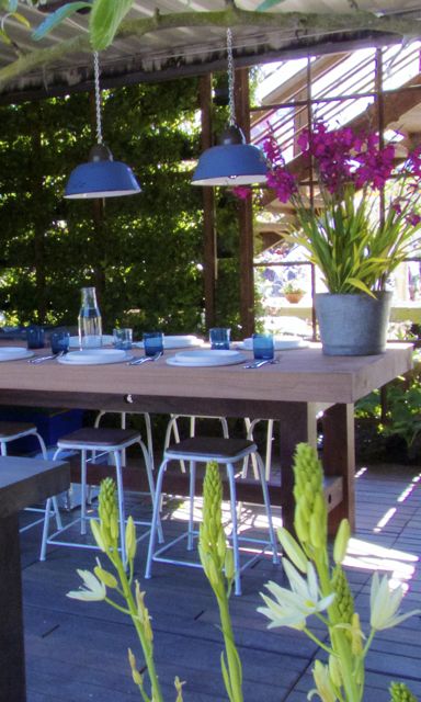
On the other side of things, an open-air dining space had been set up that featured blue light fixtures, and other blue touches, creating a very appealing space. Just outside the dining area in the same display, a portion of fence was painted powder blue, carrying the color theme throughout the garden. Blue hostas and other plantings provided finishing touches. This was a reminder that it is always important in a small garden to make sure themes are consistent and continuous or it can quickly begin to cluttered.
My meditation on the color blue has helped dispel the blues, but I still have the raccoon problem. He and his partner are too cute to exile, but there has to be a way to deter them from their wicked ways. I hear dryer sheets work …

